Redesigning the Home tab
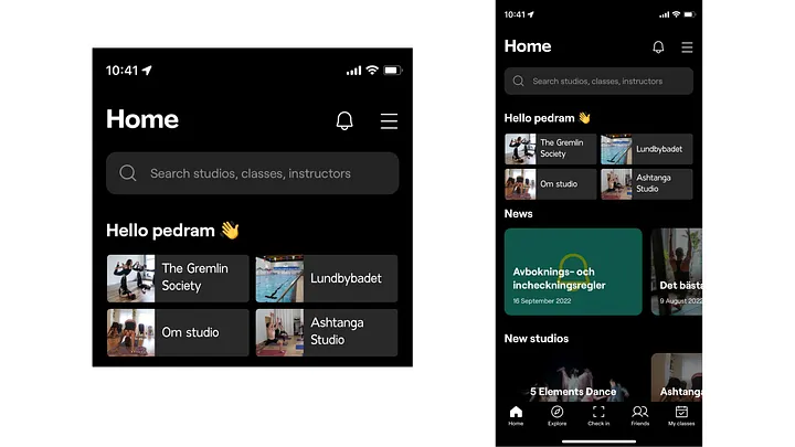
Introduce more personalized recommendations based on attendance history, favorite studios, and relevant nearby classes.
A product UX case study exploring how Bruce could increase engagement, improve clarity, and create stronger value on both sides of its fitness marketplace.
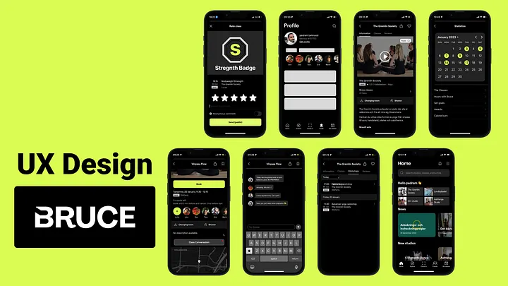
Bruce helps users book fitness classes across different studios through memberships and credits. This case study explores how the product could create a better experience for both sides of the ecosystem: users who want clearer, more motivating journeys and studios that need stronger participation and visibility.
The work focused on identifying opportunities that could improve engagement, simplify choices, and make the app feel more complete as a fitness companion rather than only a booking tool.
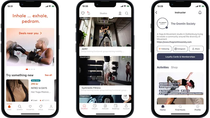
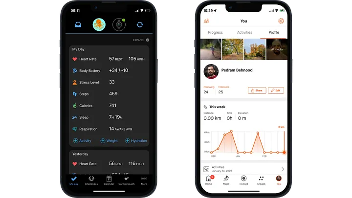
The analysis separated products Bruce directly competes with from products that offer adjacent behavior, motivation, or tracking features. That helped frame opportunities not only for booking, but also for retention and habit-building.
Direct competitors showed how class access and memberships are currently positioned in the market.
Indirect competitors like activity and habit apps revealed stronger patterns for progress tracking, motivation, and user engagement.
Part of improving the app experience meant strengthening the value proposition for partner studios, especially around flexibility, discoverability, and new booking behaviors.
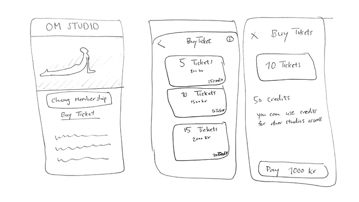
Make credits feel like a universal currency so users can clearly understand what they can book and studios can offer more flexible class access.
Extend the product beyond recurring classes by supporting workshops that deepen engagement and create more value for studios.
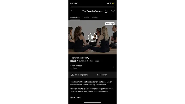
Give studios stronger ways to present themselves inside the app through richer media and clearer promotional surfaces.
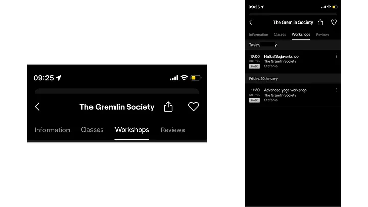
Introduce more personalized recommendations based on attendance history, favorite studios, and relevant nearby classes.
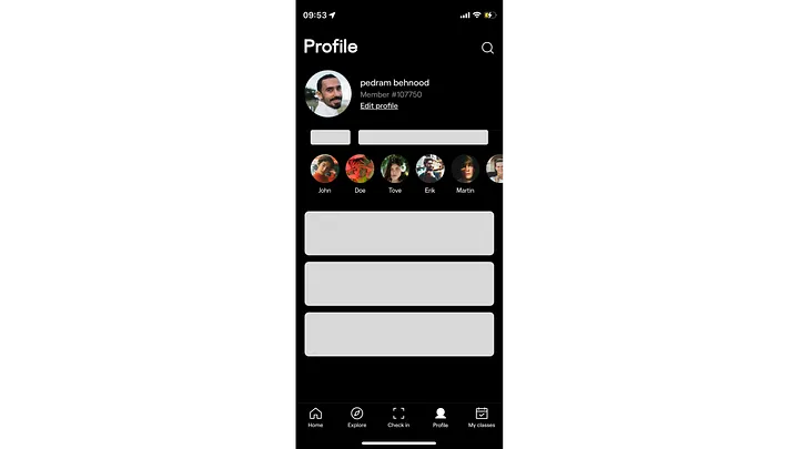
Replace the fragmented account/friends pattern with a clearer profile area for subscriptions, credits, friends, activity, and settings.
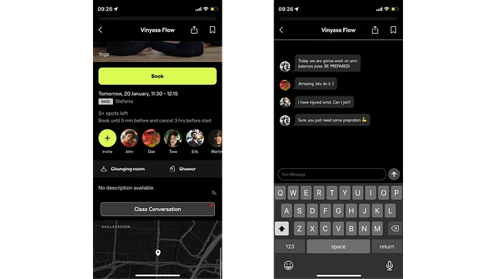
Support class-specific conversations and friend messaging so users can ask questions, coordinate, and respond to invitations naturally.
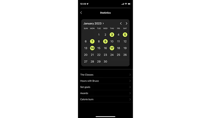
Turn attendance stats into a more meaningful progress view with routines, hours practiced, calorie burn, goals, and trends.
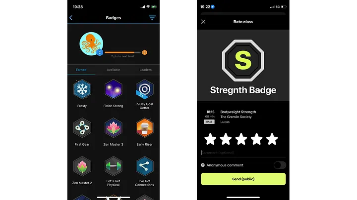
Reward consistency and milestones with badges, recognition, and small perks that reinforce habit-building.
This work framed Bruce as more than a class-booking utility. The proposed improvements aimed to make the app more useful for studios, more motivating for users, and more differentiated from simpler booking competitors.
Together, the concepts point toward a product experience that better supports discovery, communication, progress, and long-term engagement.
This case study is presented here as part of my portfolio. If you want the published article version, you can also read it on Medium.