Idea 01
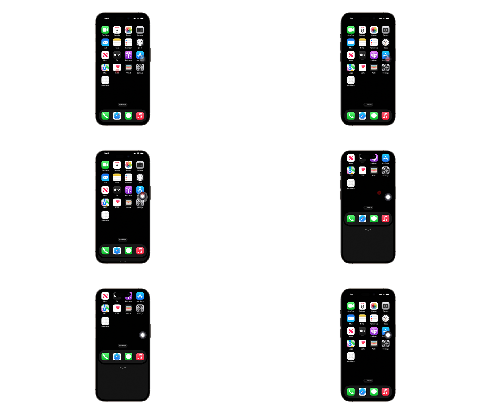
Scaled mini-screen
Project the interface into a smaller active area so the whole screen behaves like a smaller phone.
A concept case study exploring how larger iPhones can feel easier, safer, and more intuitive to use with one hand.
This project started from a personal frustration: larger iPhones made everyday actions feel awkward. Reaching the corners required grip changes, finger stretching, or a second hand, which added friction to something that should feel natural and effortless.
The goal was to explore whether interaction design could make one-handed use feel more comfortable without fighting Apple's existing mental models.
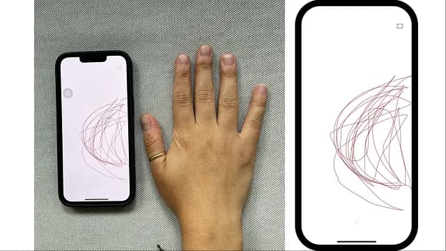
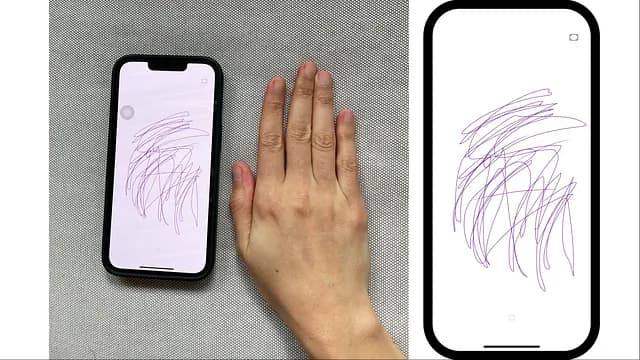
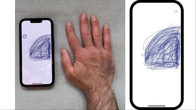
The research combined observation with a small reachability exercise on right-handed users to map where the thumb could comfortably travel while holding the phone naturally with one hand.
Most people shifted to two-handed use as soon as they needed to reach the top corners of larger iPhones.
Several users changed their grip, crawled their thumb upward, or used accessories just to feel secure while stretching.
Apple's built-in accessibility features helped, but they still interrupted the flow or felt awkward in everyday use.
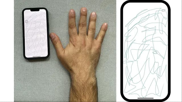
Reachability, AssistiveTouch, and Siri already help reduce effort, but each one changes the flow in a different way. That opened the opportunity to look for a solution that feels more continuous inside the normal interface.
Keep the interaction aligned with Apple's native motion and gesture language.
Support both right-handed and left-handed use through mirrored behavior.
Reduce finger strain without adding visual clutter or a steep learning curve.
Project the interface into a smaller active area so the whole screen behaves like a smaller phone.
Let users summon a reachable section of the screen without shrinking the interface itself.
Use gestures in an idle side area to slide the screen toward the thumb, making distant corners reachable.
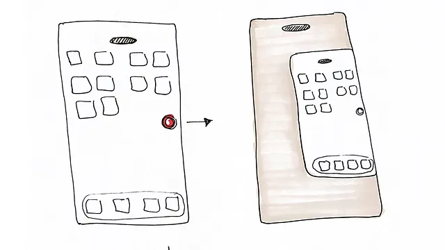
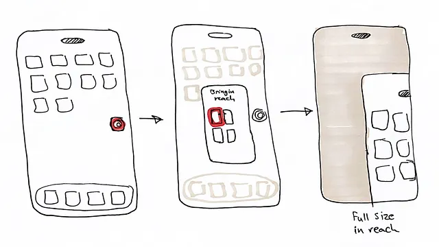
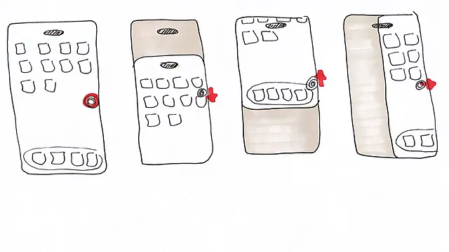
The swipe-based directional movement felt the most intuitive and the closest to Apple's interaction language, so it became the concept taken into prototyping.
The concept began in Figma, but the richer motion and screen transitions were better demonstrated in Adobe After Effects. That shift helped communicate how the screen could slide toward the thumb while preserving orientation and context.
The approach also extended well to mirrored left-handed use and offered flexibility for users with limited range of motion by combining directional moves.
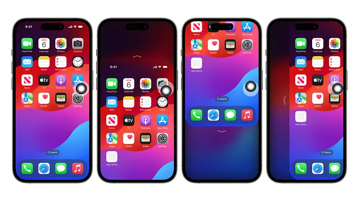
This was a concept project rather than a shipped feature, but it demonstrates a clear UX process: notice friction, observe behavior, test multiple ideas, and prototype the most promising interaction in a way that users can understand.
It also shows how accessibility and convenience can overlap, creating value for a broader range of users rather than a narrow edge case.
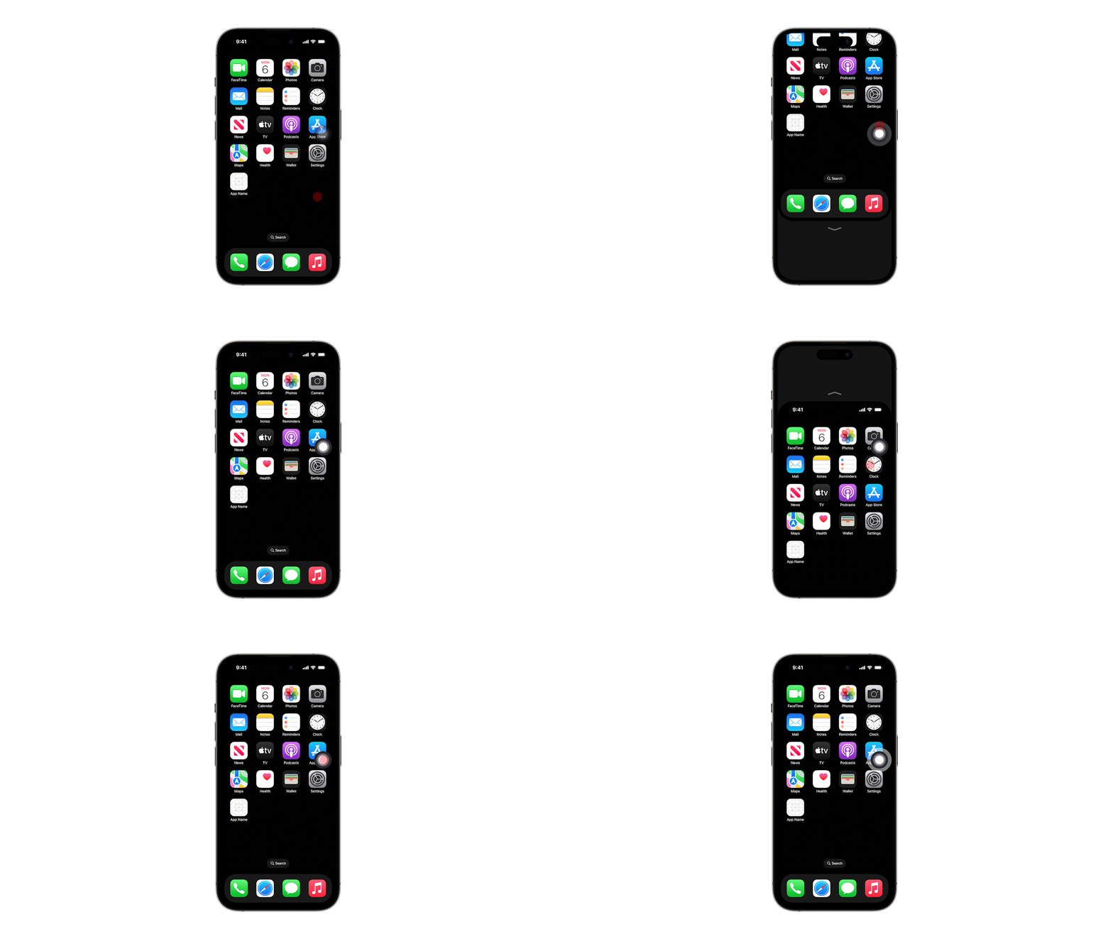
Your visuals make the interaction much easier to understand than words alone. Showing the transition states helps explain how the screen shifts while preserving orientation and confidence.
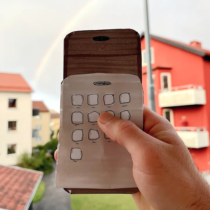
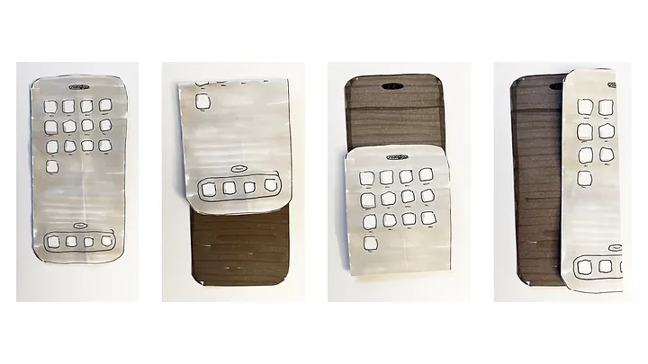
This case study is presented here as part of my portfolio. If you want the published article version, you can also read it on Medium.